Note: This article has been published at Hitachi Data Interactive, a fantastic review of current topics in XBRL. Check it out, here:
I recently posted about the new Form SD, where I asked a few questions about the structure of the XBRL taxonomy.
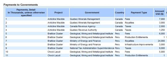
Since posting, I analyzed the instance document more closely. I also had a lively chat with the XBRL-Public Discussion group. The conversation was originally about tuples. The “Lines” of data reported (as seen in the picture below), had clear patterns; They need a Payment amount, a Project, a Country, etc. Some members, including myself, thought this was “tuple”-like.
Michelle from the Bank of Italy enlightened me as to why tuple structure is generally avoided in XBRL; the nesting of data allows taxonomy authors to create new meaning, or create the same meaning in a different way, (or hide meaning!); this wouldn’t be standard, so it wouldn’t be understood, and that’s bad.
But the tuple discussion was a tangent; I focused the second part of the conversation on missing data.
I’m sure you’ve used a PivotTable before. If not, give it a try using Google Spreadsheet. I published this pivot table using Google Spreadsheets, and I’ll be referring to it throughout this post. Click the link at the top, called “Values from XBRL Instance“. This sheet shows the data in its “raw” form. This comes directly from the XBRL Instance Document. You’ve definitely seen data like this this; a series of rows containing some primary data (like the “Value” column), and other aspects of these data:
- The Type of payment; the “Item” column
- The Country where it was paid; the “Country” column
- The Authority to which it was paid; the “Government” column
It looks the same, and it conveys the same kind of information, as the SEC’s rendering of the XBRL data, which includes an additional aspect, the “Line Number”, as if this were a printed form. We’ll get back to this, later. See the image to the right.
This is the same kind of pattern Charlie Hoffman describes here.
Make a note of the first line of data:
- A Fee
- Paid to Canada’s
- Quebec Minerals Management
- for the Anticline Miscible Project
- Of $7,000,000
If you’ve ever worked with a PivotTable, then you know that it’s trivial to make get the PivotTable from this kind of data. In Microsoft Excel, just click Insert > PivotTable. Then you can arrange the data how you want; you can drill down (filter) into specific countries, make subtotals across projects, or averages across government agencies. You can organize payments by Country, then by Government, then by the Type of Payment.
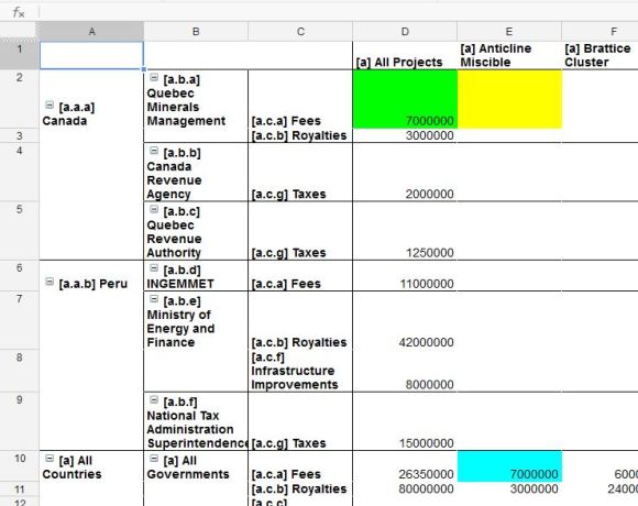
Check out the PivotTable on the second sheet called “Payments-By-Type, Country, Government, Project” Note that the Country is the first group on the rows; then the Government Authority; then the Type of Payment. Note that the Projects is the only group on the columns. Earlier I referred to these as “aspects” of the data. Technically these are “axes” (plural of “axis”). It makes much more sense when viewed as a table, because the “Country” axis is on the vertical, and the “Project” axis is on the horizontal; this is the power to arranging your XBRL data, directly out of the instance document.
But notice the yellow cell; look at the aspects in the row labels and the column labels. This cell should contain a value representing the Fee, paid to Canada’s Quebec Minerals Management, for the Anticline Miscible Project. The SEC rendering (in the screenshot above) shows us this value; we made a note of it. But why is my PivotTable missing the data?!
This is the reason for my post. The PivotTable is missing the data because of an inconsistency in the way the SEC chose to tag this data. It appears in the rendering because the value was tagged with a “Line Number” member. We discussed this above. But it wasn’t tagged with the other relevant aspects, like “Canada” member, or “Anticline Miscible” member. So why do those aspects appear in the SEC rendering? Because those words were tagged as data in and of themselves.
In other words, the SEC did not choose to qualify the value “$7,000,000” with “Canada”. I’ll call this “dimensional” tagging, or “aspect” tagging.
Instead, they chose to tag the value of “$7,000,000”, and tag the value “Canada”, and the consumers of this data are supposed to “make the connection” (infer) that “$7,000,000” is related to “Canada”, because they are both tagged with “[Line] 1” member; and so they both appear on the same line. I’ll call this “line number tagging” or “inference tagging”
So why am I complaining? Two reasons:
- Ease-of-use
- Inconsistency
Ease-of-use
I think the SEC’s choice of “line number tagging” makes the XBRL harder to use– harder to analyze. Am I contradicting myself? Earlier I said it was easy to go from the tabular format of the SEC rendering, to a powerful PivotTable. That’s true. But it’s even easier to go from the XBRL raw data as seen in my sheet, to the PivotTable as seen in my sheet. I don’t need a “rendering” in the middle. I used a free tool called XBRL Add-On, which creates the pivot-table instantaneously on opening the XBRL instance document. Many XBRL-viewing tools do this, today. This includes XBRL Cloud, Magnify, and others (I’m sure). Since the PivotTable is “built into” the XBRL, I can immediately arrange the axis like I want, or export to a spreadsheet software to do the same.
If I wanted to analyze the SEC’s tagging in the form of a PivotTable, I would have to build extra software, or go through the “extra step” of the rendering in the middle. I also refer to this “line number tagging” as “inference” tagging (above) because the data-user must infer that values on the same line, are related. Inference can be dangerous, but I don’t think there’s much risk here. However, inference is extra, unnecessary work for the data-user; i.e. harder! This defeats the purpose of XBRL.
Inconsistency
The SEC doesn’t only use this “line number tagging”. After all, as I mentioned above, my spreadsheet is the “raw XBRL data from the SEC Instance Document.” Indeed, the SEC uses “dimensional tagging” for some values. These are the values you see in the resulting PivotTable.

Green (column) is subtotal across Projects, Blue (row) is subtotal across Countries/Governments, but Yellow (intersection) is missing!
- The value highlighted in green (also $7,000,000) represents the Fees, paid to Canada’s Quebec Minerals Management, for all Projects.
- And the value highlighted in blue (yet another $7,000,000) represents the Fees, for the Anticline Miscible Project, for all Countries and all Governments.
These data were tagged in the “dimensional tagging” style. This is the standard and correct way to tag. It qualifies the data with its relevant aspects. It uses these “Country” or “Project” aspects the way XBRL Dimensions prescribes. Dimensional tagging is the correct “syntax” to represent this pivot-table “semantics”. After all, that’s why well-built XBRL Software can make the Pivot Table instantaneously; that’s why this flows seamlessly into a [Google] Spreadsheet. That’s why I can skip the written/printed form (with their “line numbers”) and start making insights directly. So the inconsistency with the “line number tagging” is twofold:
- It is inconsistent with “dimensional tagging”, which is the standard and correct way to tag. In the context of the standards, the patterns, and all observed XBRL, this Form SD XBRL is nonstandard.
- And it is internally inconsistent, the SEC tags some values with “line number tagging” and other values with “dimensional tagging” in the same instance document.
- Incidentally, it seems like the SEC chose the “line number” style of tagging to express the individual datapoints; notice how every row in their rendering has specified which Country, Project, and Government relates to each number. The very first row gives us the value I highlighted in “yellow”.
- But the SEC chose the “dimensional” style of tagging to express the subtotals/sum of these datapoints by aspect; notice how the only row with data is the “All Governments, All Countries” row (the value in blue), and the only column with data is the “All Projects” column (the value in green). Notice how yellow (cell E2) is the intersection of the green row (2) and the blue column (E).
This is especially backwards because, PivotTables will figure out those subtotals for you! If you have the individual datapoints, then a PivotTable can sum or average this data across any aspect that is meaningful for you. If you tell a computer, with “dimensional tagging”, that $500 was paid to Canada for Project 1, and $700 was paid to Canada for Project 2, the computer can tell you that $1,200 was paid to Canada for all Projects.
But if it’s provided the subtotals, the PivotTable has no idea how to get to the individual parts. If you tell a computer with “dimensional tagging”, that $800 was paid to Ghana, the computer has no idea how much was paid for each Project, and neither will the data-user.
Hence, “Missing Data”
“Missing Data” is an exaggeration; we noted that the SEC’s tagging did report the data I’d want (with “line number tagging”); it’s just non-standard and inconsistent, so it’s much harder to analyze. If the SEC corrects this, it will simplify the process for XBRL creators, and speed up consumption and analyses of the XBRL data. Isn’t that the point of Form SD? Isn’t that the point of XBRL?
